With our site now using a customized version of minima, it’s time to really dial up the changes.
Updates we’re going to make in this article include:
- Create 3 main
<div>columns to organize our site (sidebar, page content, other) with Bootstrap - Add a sidebar menu, utilizing Jekyll’s collections feature
Widen The Page
Currently, all of our page content ends up being rendered within a single <div> wrapper that is defined in ./_layouts/default.html.
<main class="page-content" aria-label="Content">
    <div class="wrapper">
    {{ content }}
    </div>
</main>
While we have taken the steps of adding minima’s _inludes and _layouts to our projects, we haven’t added the _scss content.
Learning SaSS has been on my list for a while, but for the purposes of getting this site up and running, I’ll stick with what is familiar: Bootstrap.
Bootstrap offers a simple, class-based, way to organize our site. Using the columns feature, let’s start by adding three
column <div> elements for the entire site. Note that we’re using the col-* class on each div to size it relative to the viewport. In addition, the outter-most div has the row
class to ensure that the 3 columns are actually grouped next to each other.
Add Bootstrap Assets
In order to use Bootstrap on our site, we’ll follow the Getting Started guide. For now, we’ll add the CDN-hosted CSS
links directly to the <head> section of our side, found in ./_includes/head.html. The required Javascript <script> tags will be added right before the closing </body> tag in
./layouts/default.html.
Bootstrap’s column system allows for up to 12 columns per row. The col-* class that we’re using specifies how many columns the div it’s assigned to will occupy.
For example, specifying <div class="col-6"> will make the div occupy 1/2 of the available viewport width, excluding any padding and margins. With that in mind,
our goal is to have the main content portion of our site use two-thirds of the available screen. The remaining space will be split between the two side-bars.
Here is what our new _layouts/default.html will look like:
<!DOCTYPE html>
<html lang="{{ page.lang | default: site.lang | default: 'en' }}">

  {%- include head.html -%}

  <body>

    {%- include header.html -%}

    <div class="container-fluid">
      <div class="page-content row" aria-label="Content">

        <div id="left-sidebar" class="col-2">
          {%- include sidebar.html -%}
        </div>

        <div class="col-8" aria-label="Content">
            {{ content }}
        </div>

        <div id="right-sidebar" class="col-2">
        </div>

      </div>
    </div>

    {%- include footer.html -%}

    <script src="https://cdn.jsdelivr.net/npm/bootstrap@5.1.3/dist/js/bootstrap.bundle.min.js"
            integrity="sha384-ka7Sk0Gln4gmtz2MlQnikT1wXgYsOg+OMhuP+IlRH9sENBO0LRn5q+8nbTov4+1p"
            crossorigin="anonymous"></script>
  </body>

</html>
You’ll note the new {%- include sidebar.html -%} declaration in the left-sidebar block. We haven’t written that yet so let’s get to it!
Side(bar) Action!
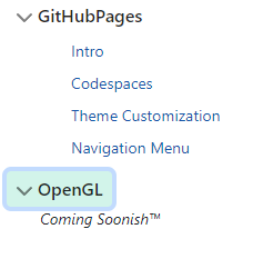
TIL will have a sidebar navigation system. The Jekyll Collection system will be used to render top level navigation items. Each top level menu item will be collapsable, using Bootstrap’s collapse mechanism. Each page within a collection will be shown as a child item of the parent button. In the example shown on the right, you’ll see that the GitHubPages collection has four child page within it. The OpenGL collection, which has no pages, shows a placeholder text value. We’ll also need to add Liquid templating logic to automatically open a top level menu if the current page being drawn is a child of that collection.
Let’s get started!
Bootstrap
Sticking with the “Bootstrap can already do that” vibe we’ve got going, we’ll crib their Collapsible menu system (live demo here). This design requires a bit of extra CSS and Javascript but we can download that directly from the bundle of examples.
CSS & JS
Copy the following files from the the Bootstrap example downloads into the site’s assets directories.
- Copy
sidebars/sidebars.cssinto theassets/css/directory in your site - Copy
sidebars/sidebars.jsin to theassets/js/directory in your site
Add CSS and JS
Add the following <script> block directly before the closing </head> block in _layouts/default.html:
<script src="/assets/js/sidebar.js"></script>
Add the following stylesheet reference within your <head> block of _includes/head.html:
<link href="/assets/css/sidebar.css" rel="stylesheet">
Collections
Jekyll collections allow us to bundle pages into logical groups for our site.
We currently have a few pages already defined for GitHub Pages tutorials. We’ll add another placeholder collection, OpenGL, for
some future tutorials. Here is the section we’ll add to the _config.yml to define the collections;
collections:
  GitHubPages:
    output: true
    permalink: /:collection/:name

  OpenGL:
    output: true
    permalink: /:collection/:name
Each collection is defined by a directory with the same name, prefixed with an underscore. _GitHubPages and _OpenGL
exist, but _OpenGL is currently empty since there aren’t any pages written for it yet.
./_includes/sidebar.html
With Bootstrap ready to roll out locally and our collections defined, now let’s define the HTML for the sidebar.
<div class="flex-shrink-0 p-3 bg-white">
    <a href="/" class="d-flex align-items-center pb-3 mb-3 link-dark text-decoration-none border-bottom">
      <span class="fs-5 fw-semibold">le menu</span>
    </a>
    <ul class="list-unstyled ps-0" style="margin-left: 0;">

      {% for collection in site.collections %}

        {% if collection.label != 'posts'%}
          <li class="mb-1">

            {% if page.collection == collection.label %}
              <button class="btn btn-toggle align-items-center rounded"
                      data-bs-toggle="collapse" data-bs-target="#{{collection.label}}-collapse"
                      aria-expanded="true">
            {% else %}
              <button class="btn btn-toggle align-items-center rounded collapsed"
                      data-bs-toggle="collapse" data-bs-target="#{{collection.label}}-collapse"
                      aria-expanded="false">
            {% endif %}
              {{ collection.label }}
            </button>

            <div class="collapse{% if page.collection == collection.label %} show{% endif %}" id="{{collection.label}}-collapse">
              <ul class="btn-toggle-nav list-unstyled fw-normal small" style="margin-left: 0;">

                {% assign sorted-docs = collection.docs | sort: "order" %}

                {% for doc in sorted-docs %}
                  <li><a href="{{doc.url}}" class="link-dark rounded">{{doc.title}}</a></li>
                {% else%}
                  <i>Coming Soonish™</i>
                {% endfor %}
              </ul>
            </div>
          </li>
        {% endif %}
      {% endfor %}


    </ul>
  </div>
Let’s break down this file and describe what each sections are going.
The first element displays a menu header, which links to the homepage.
<a href="/" class="d-flex align-items-center pb-3 mb-3 link-dark text-decoration-none border-bottom">
  <span class="fs-5 fw-semibold">le menu</span>
</a>
This is where the looping fun begins. Spin that record, DJ!
The menu will be rendered as a list, via the <ul> element type. Looping through all of the collections
is as simple as using the Liquid {% for %} loop.
One gotcha is that there is a hidden collection always present named posts. We filter that out from our list of
collections using an if statement.
<ul class="list-unstyled ps-0">

  {% for collection in site.collections %}

    {% if collection.label != 'posts'%}
Next up, let’s define the HTML for the top level button. Don’t be confused by seeing two <button> elements. They are wrapped
in a conditional if statement. The conditional will evaluate to true if the collection of the current page being rendered matches the current collection being iterated over.
<li class="mb-1">

  {% if page.collection == collection.label %}
    <button class="btn btn-toggle align-items-center rounded"
            data-bs-toggle="collapse" data-bs-target="#{{collection.label}}-collapse"
            aria-expanded="true">
  {% else %}
    <button class="btn btn-toggle align-items-center rounded collapsed"
            data-bs-toggle="collapse" data-bs-target="#{{collection.label}}-collapse"
            aria-expanded="false">
  {% endif %}
    {{ collection.label }}
  </button>
In order to exert some control on the order that the pages are shown in the menu, a new variable, order, will be added to the front matter of our sites’ pages.
Front Matter for _GitHubPages/index.md
---
title: Intro
layout: default
order: 1
---
Next up, we’ll itterate over all of the pages that belong to the current container. The same if conditional that was
used above will be used again to add the show CSS class to the division containing all of the links on load.
To accomplish the page sorting, pass in a list of all the documents (collection.docs) to the Liquid sort filter along with the variable to sort on, “order” in this case. The result of that sort will be stored in the sorted-docs variable, which is what will be iterated on by the following for loop.
NOTE
The {% else %} clause that is defined after the {% for %} clause will be only be executed if there are no for loop
entries (aka: there are no pages in the collection).
Also, to make sure the child page links aren’t over-indented, we set the margin-left style to 0 using the style parameter
directly on the <ul> element for the pages.
<div class="collapse{% if page.collection == collection.label %} show{% endif %}" id="{{collection.label}}-collapse">
  <ul class="btn-toggle-nav list-unstyled fw-normal small" style="margin-left: 0;">

    {% assign sorted-docs = collection.docs | sort: "order" %}

    {% for doc in sorted-docs %}
      <li><a href="{{doc.url | relative_url}}" class="link-dark rounded">{{doc.title}}</a></li>
    {% else %}
      <i>Coming Soonish™</i>
    {% endfor %}
  </ul>
</div>
And that’s it! We now have a sidebar menu that will dynamically populate based on our configuration and content.
Going forward all that’s required to add a new top level category is to update _config.yml, create the directory to
hold the pages, and start writing contents.